AI PowerPoint Course · Your First Pro Slides (Build Core Layouts with Confidence)
Your First Pro Slides Notes: Core Layouts (Title, Agenda, Quote)
 Arun Nagarathanam · 10 Jul 2026 Notes · 6 of 16 in this course
 An exclusive resource for students of Arun's AI PowerPoint Course.
Your First Pro Slides (Build Core Layouts with Confidence)
It's time to apply your skills to build the most common and essential "building block" slides that form the backbone of any professional presentation.
Lecture 18
The Title Slide (Making a Powerful First Impression)
Key Takeaways
- 01Key Idea: A great title slide isn't about finding a magic template; it's about making simple, intentional choices.
- 02Core Principles:
- Powerful Image: Use a high-quality, relevant image to set the mood.
- Figure-Ground: Apply a semi-transparent dark overlay on your image. This pushes the image into the background and makes your text pop with perfect clarity.
- Visual Hierarchy: Make the main title large and bold to tell the audience what to read first.
- Rule of Thirds: Place text off-center, near the intersections of an imaginary 3x3 grid, for a more dynamic and balanced feel.
- White Space: Use empty space to reduce clutter and make your slide feel more confident and elegant.
Lecture 20
The Agenda Slide (Providing a Clear Roadmap, Not a To-Do List)
Key Takeaways
- 01Key Idea: An agenda's job is not to be a table of contents, but to build trust and provide a clear roadmap for your audience.
- 02Core Principles:
- Numbered List: Use numbers instead of bullets to show a clear, logical sequence.
- Proximity: Group the number, title, and description for each point closely together so they are seen as a single unit.
- Visual Hierarchy: Make the title for each point bold and larger than the description to make the slide easily scannable.
- Simplicity: Limit your agenda to no more than 3-5 main points.
Lecture 22
The Section Divider (Signaling a Smooth Transition)
Key Takeaways
- 01Key Idea: A Section Divider is a simple, clean signpost that tells your audience you're moving to a new topic. Its only job is to signal a transition.
- 02Core Principles:
- Similarity: Use a consistent design (e.g., a bold background color) for all section dividers to train your audience that this look means a new section is starting.
- Minimalist Design: The slide should be extremely simple, with a huge title, a small section number, and nothing else competing for attention.
- White Space: Use generous empty space to make the signal impossible to miss and give the audience a moment to mentally reset.
Lecture 24
The Text & Image Slide (Balancing Words and Visuals in Harmony)
Key Takeaways
- 01Key Idea: The goal is not just to have words and a picture, but to make them work together in harmony to tell a single, powerful story.
- 02Core Principles:
- Rule of Thirds: Divide the slide into one-third for the image and two-thirds for the text (or vice versa). This asymmetrical balance is more dynamic and visually interesting than a 50/50 split.
- Dual Coding Theory: Pair a relevant image with clear text. This helps the audience process and remember the information more effectively by using both visual and verbal channels.
- Visual Hierarchy & White Space: Use a clear hierarchy (headline, paragraph, bullets) and ample white space to make your text easy to read and not feel crammed.
Lecture 26
The Bullet Point Slide (Escaping the "Wall of Text" Trap)
Key Takeaways
- 01Key Idea: Your slide is not a script. The audience cannot read a wall of text and listen to you at the same time. Bullet points must be a tool for clarity, not boredom.
- 02Core Principles:
- Rule of Three: Limit yourself to three key ideas per slide. A slide with three points will be remembered; a slide with ten will be forgotten.
- White Space: Use generous space between your points to give each idea its own breathing room, making the list easier to scan.
- Dual Coding (Icons): Replace boring black dots with meaningful icons. The icon is a visual code that reinforces the text and adds visual interest.
- Visual Hierarchy: Give each point a bolded headline for the main idea and a short description for the supporting detail.
Lecture 29
The Quote Slide (Giving Words a Stage for Maximum Impact)
Key Takeaways
- 01Key Idea: A quote isn't just information; it's a performance. Your job as a designer is to build a "stage" that gives the words focus and impact.
- 02Core Principles:
- White Space: This is the most important principle for quotes. Use massive amounts of empty space to isolate the quote, remove all distractions, and signal its importance.
- Typography: Use a different font (e.g., a classic Serif font) and italics to signal a shift in voice and set a specific tone.
- Visual Hierarchy: Make the quote itself large and commanding. The name of the person who said it should be much smaller and less prominent.
- Visual Anchor: Use a large, stylized quotation mark icon to immediately signal the purpose of the slide.


Keep building
More from Aruntastic
Practical courses for people who want to build useful things with AI.

AI SEO Course 2026: From Zero to Page-One Results
Research search demand, structure useful pages, and work through technical and off-page SEO.
Open the course →
AEO, GEO, AI SEO: Get Cited by ChatGPT, Google, Perplexity
Study how AI search finds information, and make your pages clear enough to be cited.
Open the course →
Microsoft PowerPoint Presentation 2026 for Professionals
Learn visual hierarchy, slide composition, typography and animation through practical work.
Open the course →
AI Leadership: Gen AI for Leaders, A Practical Toolkit
A short course on using generative AI as a co-pilot, written for senior leaders.
Open the course →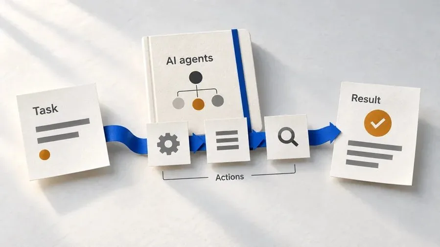
Agentic AI Explained: How AI Agents Actually Work
Coming soon. Follow real agent work, then learn how models, tools, memory and checks fit together.
Join the waitlist →Toolkits and programme
Go deeper

Toolkit
SEO Accelerator Toolkit
150+ copy-paste AI prompts for audience research, keywords, content, technical SEO and link building.
Toolkit
GEO Accelerator Toolkit
100 detailed AI prompts for GEO audits, entity building, content structure and client reporting.

Programme
GEO Authority Accelerator
A complete GEO programme on our learner platform: nine modules and a 30, 60, 90 day roadmap. The GEO Accelerator Toolkit is included.
Claude certification practice
Preparing for a Claude certification?
Practice exams written by Arun: 600 questions across 4 mock exams and 2 drill banks. Unofficial preparation, not affiliated with Anthropic.
 CCAR-F
 CCAO-F
 CCDV-F
 CCAR-P
See Where You Stand
This resource is one piece of a much bigger system.
Take the free GEO Readiness Quiz to see exactly where your business stands with AI search engines today.
Take the GEO Readiness Quiz 60 seconds · Personalized report · Free