AI PowerPoint Course · Your Creative Toolkit (Fonts, Colors & Images)
Your Creative Toolkit Notes: Fonts, Colors, Images, Icons
 Arun Nagarathanam · 10 Jul 2026 Notes · 4 of 16 in this course
 An exclusive resource for students of Arun's AI PowerPoint Course.
Your Creative Toolkit (Fonts, Colors & Images)
This section equips you with the essential creative assets for any presentation. You will learn the simple, professional rules for choosing and using fonts, colors, images, and icons to create a cohesive and beautiful design.
Lecture 8
Choosing Fonts (That Don't Look Unprofessional)
Key Takeaways
- 01Rule #1: For presentations, use clean, modern Sans Serif fonts (the ones without the little "feet") because they are easier to read on screens.
- 02Pro Method 1 (One Font): Use a single font family and create variety with different weights (e.g., Bold for titles, Regular for body text). This is a fast way to look professional.
- 03Pro Method 2 (Two Fonts): When pairing fonts, combine a strong headline font with a simple, highly-readable body font.
Lecture 9
AI Quick Win (Generating Professional Font Pairings)
Applied Learning
- 01Key Idea: Use AI tools (like Gemini, ChatGPT, or Copilot) to get professional font pairing ideas in seconds.
- 02The Pro Prompt: Give the AI context for better results. Tell it your audience, topic, and the desired feeling (e.g., "modern, trustworthy, and authoritative").
Lecture 10
Choosing Colors (Without the Stress & Guesswork)
Key Takeaways
- 01The Most Important Rule: Contrast. Your text must be easy to read against its background.
- 02The Pro Method: Don't guess if your colors work. Use a free online "Contrast Checker" to test your text and background colors.
- 03Simple Palette Structure: A great palette usually only needs: a dark color for text, a light color for the background, and one or two accent colors for highlighting.
Lecture 11
AI Quick Win (Generating Professional Color Palettes)
Applied Learning
- 01Key Idea: Use an AI tool to generate a complete, professional color palette based on your presentation's needs.
- 02The Pro Prompt: Provide the AI with your topic, audience, and desired vibe to get a custom theme with hex codes and a design rationale.
- 03Try It Free: The AI presentation theme generator runs this prompt for you and checks each palette's contrast.
Lecture 12
Choosing Images (That Don't Look Like Cheesy Stock Photos)
Key Takeaways
- 01The Secret: Look for images that have three key ingredients:
- Emotion: It makes the audience feel something (e.g., excitement, focus, collaboration).
- Composition: It's well-composed, often with clean, empty space ("negative space") where you can place text.
- Authenticity: It feels real and genuine, not like a cheesy or fake stock photo.
Lecture 13
AI Quick Win (Creating Custom, On-Brand Images)
Applied Learning
- 01Key Idea: Use AI image generators to create the exact image you need from scratch.
- 02The Pro Prompt: Write a detailed description of the image you want, including the style, subject, and, most importantly, the hex codes from your color palette to ensure it matches your theme perfectly.
Lecture 14
Using Icons & Graphics (The Power of SVGs)
Key Takeaways
- 01Rule #1: Consistency. All your icons should have the same visual style (e.g., all "line-art" or all "solid-fill"). Mixing styles looks messy.
- 02The Pro Format: Always use SVG.
- 03SVG Superpowers:
- Scalability: They stay perfectly sharp at any size.
- Editability: You can "Convert to Shape" in PowerPoint to change the color of individual parts of the icon.
Lecture 15
Finding Great Icons (A Pro Workflow)
Actionable Items
- Filter by Style: On icon websites, first filter the results to a single style you like (e.g., "Outline").
- Find a Set: Click on an icon's "pack" or collection to find other icons created in the same consistent style.
- Download as SVG: Always choose the SVG format for maximum quality and control.
Lecture 16
AI Quick Win (Creating Custom, On-Brand Icons)
Applied Learning
- 01Key Idea: Use an AI icon generator to create a custom SVG icon when you can't find what you need.
- 02The Pro Prompt: Be specific. Tell the AI the subject, the style (e.g., "minimalist, single-line icon"), and the exact hex code for the color you want.
Lecture 17
Tying It All Together (The Four Pillars of Consistency)
Key Takeaways
- 01The Ultimate Principle: Consistency is what makes a presentation look polished, professional, and intentional.
- 02The Four Pillars of Consistency:
- Typography: Use the same fonts for the same jobs on every slide (e.g., all titles look the same).
- Color: Stick to your defined color palette.
- Image: Use photos with a similar feel and tone.
- Graphic: Use icons that are all in the same style.


Keep building
More from Aruntastic
Practical courses for people who want to build useful things with AI.

AI SEO Course 2026: From Zero to Page-One Results
Research search demand, structure useful pages, and work through technical and off-page SEO.
Open the course →
AEO, GEO, AI SEO: Get Cited by ChatGPT, Google, Perplexity
Study how AI search finds information, and make your pages clear enough to be cited.
Open the course →
Microsoft PowerPoint Presentation 2026 for Professionals
Learn visual hierarchy, slide composition, typography and animation through practical work.
Open the course →
AI Leadership: Gen AI for Leaders, A Practical Toolkit
A short course on using generative AI as a co-pilot, written for senior leaders.
Open the course →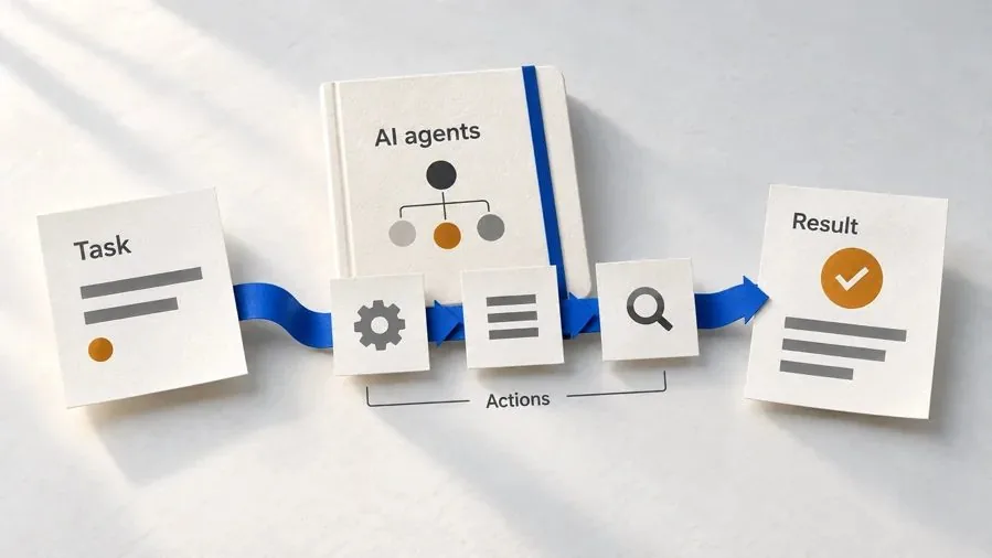
Agentic AI Explained: How AI Agents Actually Work
Coming soon. Follow real agent work, then learn how models, tools, memory and checks fit together.
Join the waitlist →Toolkits and programme
Go deeper
Toolkit
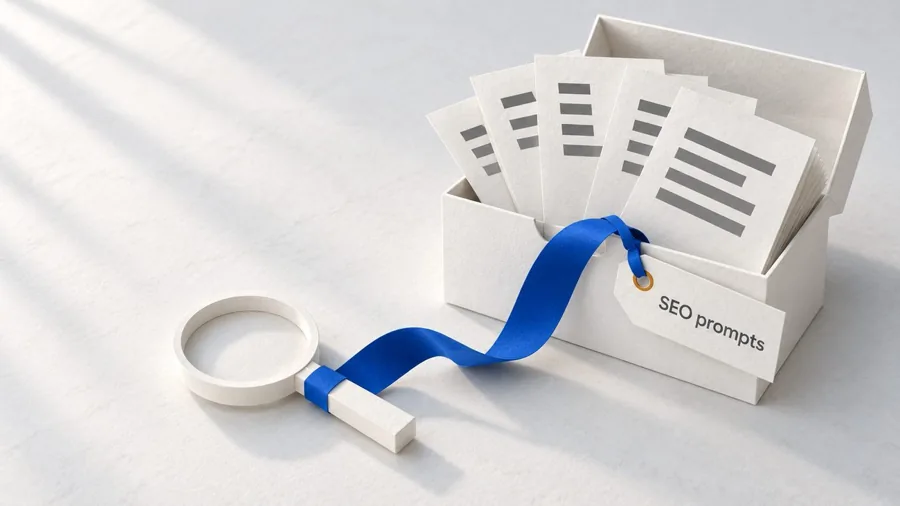
SEO Accelerator Toolkit
150+ copy-paste AI prompts for audience research, keywords, content, technical SEO and link building.
Toolkit
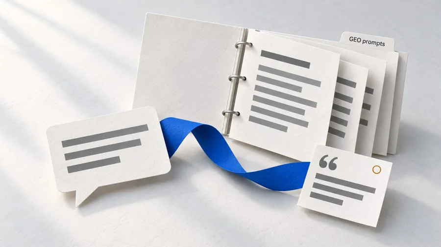
GEO Accelerator Toolkit
100 detailed AI prompts for GEO audits, entity building, content structure and client reporting.

Programme
GEO Authority Accelerator
A complete GEO programme on our learner platform: nine modules and a 30, 60, 90 day roadmap. The GEO Accelerator Toolkit is included.
Claude certification practice
Preparing for a Claude certification?
Practice exams written by Arun: 600 questions across 4 mock exams and 2 drill banks. Unofficial preparation, not affiliated with Anthropic.
 CCAR-F
 CCAO-F
 CCDV-F
 CCAR-P
See Where You Stand
This resource is one piece of a much bigger system.
Take the free GEO Readiness Quiz to see exactly where your business stands with AI search engines today.
Take the GEO Readiness Quiz 60 seconds · Personalized report · Free