AI PowerPoint Course · Visualizing Information Clearly (Master Charts, Diagrams & Timelines)
Visualizing Information Clearly: Charts, Diagrams, Timelines
 Arun Nagarathanam · 10 Jul 2026 Notes · 10 of 16 in this course
 An exclusive resource for students of Arun's AI PowerPoint Course.
Your efficient companion to the Visualizing Information Clearly video lectures
Goal: This lab equips you with the skills to turn data, processes, and steps into clear, compelling visuals that tell a story.
Visualizing Information Clearly (Master Charts, Diagrams & Timelines)
The Bar Chart Slide: Comparing Categories
Key Idea: The job of a chart is to tell a single, clear story with your data.
When to Use: A bar chart is the perfect tool for comparing the values of different, distinct categories.
Core Principles:
- 01Remove "Chart Junk": Delete unnecessary elements like 3D effects, dark gridlines, and legends to reduce cognitive load and make the data the hero.
- 02Von Restorff Effect (Strategic Color): Make all bars a neutral color except for the single most important one you want to highlight. This visually screams, "Look at this!" and makes your point unforgettable.
Visualizing Information Clearly (Master Charts, Diagrams & Timelines)
The Line Chart Slide: Showing Trends Over Time
Key Idea: A line chart is a narrative; it has a beginning, a middle, and an end.
When to Use: A line chart is the best tool for showing a continuous series of data over time (e.g., monthly sales, website traffic).
Core Principles:
- 01Continuity: Our eyes naturally follow the smoothest path. Make the line the clear hero of the slide, guiding the audience's eyes on a journey.
- 02Simplicity: Keep the design clean with subtle gridlines and clear labels so nothing distracts from the trend line.
- 03Smoothed Line: Use the "Smoothed line" option in PowerPoint to give the trend a more fluid and professional look.
Visualizing Information Clearly (Master Charts, Diagrams & Timelines)
The Pie / Donut Chart Slide: Visualizing Proportions
Key Idea: A pie chart should be used only to show parts of a whole, and it must be kept simple.
When to Use: Use to show proportions like market share or budget allocation.
Core Principles:
- 01Use a Donut Chart: A donut chart is more professional than a pie chart. The hole in the middle is perfect for placing a key takeaway (e.g., "45% of Total Market").
- 02The Golden Rule: Never have more than five slices. Any more than that becomes a confusing mess.
- 03Dual Coding: Use the chart on one side and explanatory text on the other. The text should explain the "so what?" behind the data.
Visualizing Information Clearly (Master Charts, Diagrams & Timelines)
The Process / Steps Slide: Explaining a Workflow
Key Idea: Simplify a complex workflow down to its absolute essence to make it easy to follow.
Core Principles:
- 01Continuity: Use arrows to create a clear, smooth path for the audience's eyes to follow from one step to the next.
- 02Rule of Three: Simplify your process into three main phases or steps. This is the gold standard for simplicity and memorability.
- 03Von Restorff Effect: Use color to highlight the most critical or central part of the workflow.
Visualizing Information Clearly (Master Charts, Diagrams & Timelines)
The Timeline Slide: Illustrating a Chronology
Key Idea: A timeline should show a clear progression of events that the audience can understand in a single glance.
Core Principles:
- 01Continuity: Use a strong, central horizontal line as the hero of the slide. This acts as a visual anchor for the entire journey.
- 02Symmetry and Order: Alternate your milestones, placing some above the line and some below. This creates a balanced composition and saves space.
- 03Keep it Simple: Don't try to cram every detail onto the slide. Select only the 4-5 most critical milestones to reduce cognitive load.
Visualizing Information Clearly (Master Charts, Diagrams & Timelines)
The Comparison Slide: Showing a Side-by-Side
Key Idea: Your job is to make the choice easy for your audience by organizing information so their brain can process it effortlessly.
Core Principles:
- 01Symmetry and Order: Place the options in perfectly aligned, symmetrical columns. This makes the comparison feel fair, balanced, and logical.
- 02Von Restorff Effect: Make your recommended option visually distinct (e.g., a different color border, a "Most Popular" tag) to subtly guide the audience's choice.
- 03Dual Coding (Icons): Use simple icons (like green checkmarks and red X's) next to short phrases. This makes the features instantly scannable without reading dense paragraphs.
Visualizing Information Clearly (Master Charts, Diagrams & Timelines)
The Key Takeaways / Summary Slide: Reinforcing Your Message
Key Idea: Your summary slide is the "End" of the experience and your last chance to control what the audience remembers (Peak-End Rule).
Core Principles:
- 01Rule of Three: Be a ruthless editor. Distill your entire presentation down to the three most critical, memorable, and actionable points.
- 02Symmetry and Order: Use a simple, clean, three-column layout. The balanced structure feels professional and is easy for the brain to scan.
- 03Visual Hierarchy: Within each point, use a large number (01, 02, 03), a bolded headline, and a short description to create a perfect, scannable structure.


Keep building
More from Aruntastic
Practical courses for people who want to build useful things with AI.

AI SEO Course 2026: From Zero to Page-One Results
Research search demand, structure useful pages, and work through technical and off-page SEO.
Open the course →
AEO, GEO, AI SEO: Get Cited by ChatGPT, Google, Perplexity
Study how AI search finds information, and make your pages clear enough to be cited.
Open the course →
Microsoft PowerPoint Presentation 2026 for Professionals
Learn visual hierarchy, slide composition, typography and animation through practical work.
Open the course →
AI Leadership: Gen AI for Leaders, A Practical Toolkit
A short course on using generative AI as a co-pilot, written for senior leaders.
Open the course →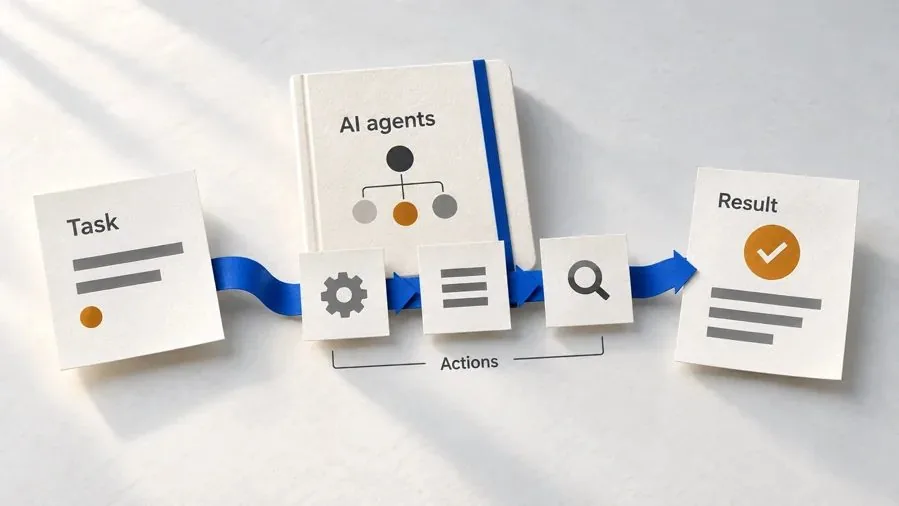
Agentic AI Explained: How AI Agents Actually Work
Coming soon. Follow real agent work, then learn how models, tools, memory and checks fit together.
Join the waitlist →Toolkits and programme
Go deeper

Toolkit
SEO Accelerator Toolkit
150+ copy-paste AI prompts for audience research, keywords, content, technical SEO and link building.

Toolkit
GEO Accelerator Toolkit
100 detailed AI prompts for GEO audits, entity building, content structure and client reporting.

Programme
GEO Authority Accelerator
A complete GEO programme on our learner platform: nine modules and a 30, 60, 90 day roadmap. The GEO Accelerator Toolkit is included.
Claude certification practice
Preparing for a Claude certification?
Practice exams written by Arun: 600 questions across 4 mock exams and 2 drill banks. Unofficial preparation, not affiliated with Anthropic.
 CCAR-F
 CCAO-F
 CCDV-F
 CCAR-P
See Where You Stand
This resource is one piece of a much bigger system.
Take the free GEO Readiness Quiz to see exactly where your business stands with AI search engines today.
Take the GEO Readiness Quiz 60 seconds · Personalized report · Free