Claude Code Course
The Five Design Improvements Review
 Arun Nagarathanam · 31 Aug 2026 Prompt · 28 of 72 in this course
 An exclusive resource for students of Arun's Claude Code Course.
There is a thing Claude can do for your design that is genuinely useful, and a thing it cannot do that is better to know now than to discover at midnight before a deadline.
Claude knows the documented design rules. Typography hierarchy, spacing systems, contrast ratios, hover states, line-length conventions. These are well-defined patterns it has read across thousands of codebases and design references. Ask which of them your project is breaking and it gives you a useful, specific list.
What Claude cannot do is tell you whether the result feels right. The taste is the part you bring.
My portfolio works, but something about it still feels a little homemade. And I can't tell you exactly what. Take a look through the files and tell me what stands out to you. I would like five specific improvements that would make it look more professional, the kind of things a designer would catch, like the typography, the spacing, the contrast, how things are grouped.
This works on any project, at any stage, as many times as you want. Your own run will surface different items, because Claude calibrates to whatever your CSS actually shows. The pattern of asking is what transfers, not the five suggestions.
The follow-up, and why it is the interesting half
A good review is not a to-do list you accept whole. Pick the ones that actually bother you.
Start with the two that bother me most, the headings that don't match and the page feeling cramped. Don't just nudge the numbers until it looks better though. Fix both properly, in a way that stays consistent across the whole site and holds up when I add new sections later.
The thing to copy is that this uses no design vocabulary at all, just the words for what your own eye can see. And Claude answers with engineering.
It said the right fix for both was not new numbers, it was a single source of truth for each. One heading size that every section reuses, and one rhythm value the whole page reads its breathing room from. Add a brand-new section next year and it inherits both automatically.
You describe what your eye catches, and Claude turns it into structure. That translation is why you do not need the vocabulary before you start.
Where the rules stop
Half of what makes a layout feel professional is rule-following, and that half can be learned, measured and applied. The other half is judgment.
Does the warmth of the headline colour match the personality you want to project? Is the slight asymmetry intentional, or accidental? Does the about section sound like a real person, or a LinkedIn profile?
Claude cannot answer those, and that is fine. The answers are what makes the work yours instead of generic.
Every time you apply the rule-following suggestions, your own eye gets a little sharper at spotting the same patterns yourself.


Keep building
More from Aruntastic
Practical courses for people who want to build useful things with AI.

AI SEO Course 2026: From Zero to Page-One Results
Research search demand, structure useful pages, and work through technical and off-page SEO.
Open the course →
AEO, GEO, AI SEO: Get Cited by ChatGPT, Google, Perplexity
Study how AI search finds information, and make your pages clear enough to be cited.
Open the course →
Microsoft PowerPoint Presentation 2026 for Professionals
Learn visual hierarchy, slide composition, typography and animation through practical work.
Open the course →
AI Leadership: Gen AI for Leaders, A Practical Toolkit
A short course on using generative AI as a co-pilot, written for senior leaders.
Open the course →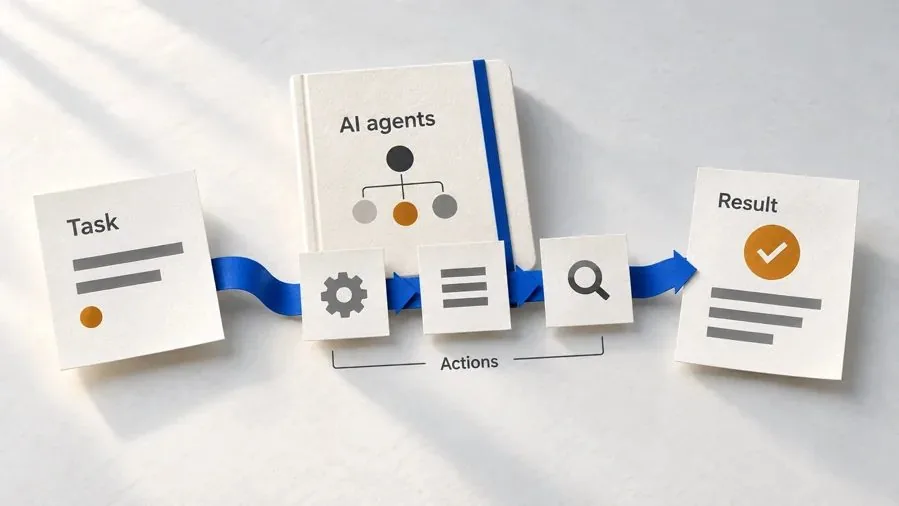
Agentic AI Explained: How AI Agents Actually Work
Coming soon. Follow real agent work, then learn how models, tools, memory and checks fit together.
Join the waitlist →Toolkits and programme
Go deeper

Toolkit
SEO Accelerator Toolkit
150+ copy-paste AI prompts for audience research, keywords, content, technical SEO and link building.

Toolkit
GEO Accelerator Toolkit
100 detailed AI prompts for GEO audits, entity building, content structure and client reporting.

Programme
GEO Authority Accelerator
A complete GEO programme on our learner platform: nine modules and a 30, 60, 90 day roadmap. The GEO Accelerator Toolkit is included.
Claude certification practice
Preparing for a Claude certification?
Practice exams written by Arun: 600 questions across 4 mock exams and 2 drill banks. Unofficial preparation, not affiliated with Anthropic.
 CCAR-F
 CCAO-F
 CCDV-F
 CCAR-P
See Where You Stand
This resource is one piece of a much bigger system.
Take the free Claude Code Readiness Quiz. It is 15 short situations, scored out of 100, and it tests how you handle a job rather than what you know about a tool, so you can take it without ever having opened Claude Code.
Take the Claude Code Readiness Quiz 15 situations · Scored out of 100 · Free