Presentations
How to Choose Presentation Colors and Fonts
Quick Answer
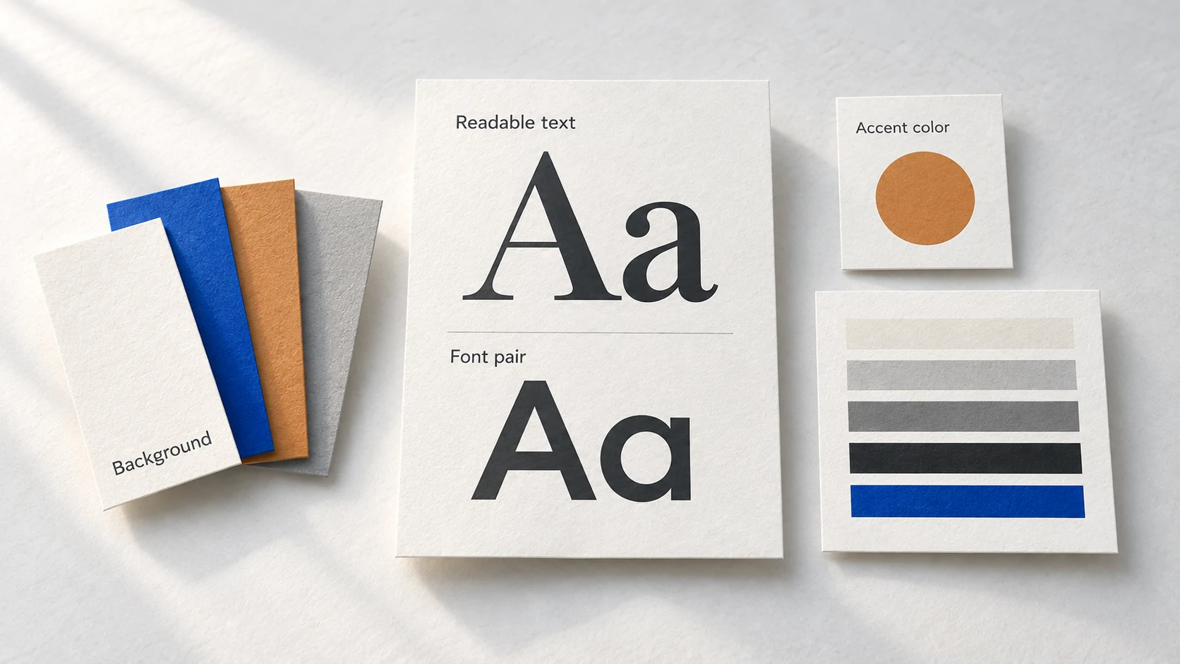
Choose presentation colors and fonts for the people and room you will present to. Use a background, readable text, one to three accents, and one font or a font pair. Check text and heading contrast against the numbers below before you present.
A slide can look polished on your laptop and become hard to read across a bright meeting room. You also want your deck to look credible beside a competitor's. For a client pitch, board meeting, or team update, you need choices you can trust before you spend the evening adjusting colors.
Choose presentation colors and fonts for the room
Before opening a color picker, think about where the deck will be shown. Will people watch from the back of a room, or read the slides on their own screens?
Then name the presentation topic, the audience, and the feel you want. A client pitch may call for a different feel from a team update.
Start with a light or dark background that suits the setting. Choose text that stands clearly against it, then choose accents for what you need to highlight.
Give each color a job
You need a background, a text color, and one to three accents. The background covers most of each slide. Accents draw attention to headings or selected parts of a chart.
PowerPoint groups the colors you use across a presentation in a theme. A theme contains four text and background colors, six accent colors, and two hyperlink colors, according to Microsoft. You do not need to use every theme color.
Give the main background 60% of the slide, a secondary color 30%, and an accent 10%. Interior design calls this the 60-30-10 rule. On a slide, the secondary color can fill a panel while the accent marks what you want people to notice.
Use the 60-30-10 split as a guide to emphasis. Text needs space, and several accents must share the small accent area.
| Role | What it does on the slide | Share of the slide |
|---|---|---|
| Background | Main field, with a secondary color available for panels | 60% main field and 30% panels in the 60-30-10 guide |
| Text | Carries the words people must read | No fixed share. Give the words the space they need |
| Accent 1 | Marks headings and the main point to notice | Part of the 10% accent area |
| Accents 2 and 3 | Mark other useful distinctions | Share the same 10% accent area when used |

Check contrast before trusting the screen
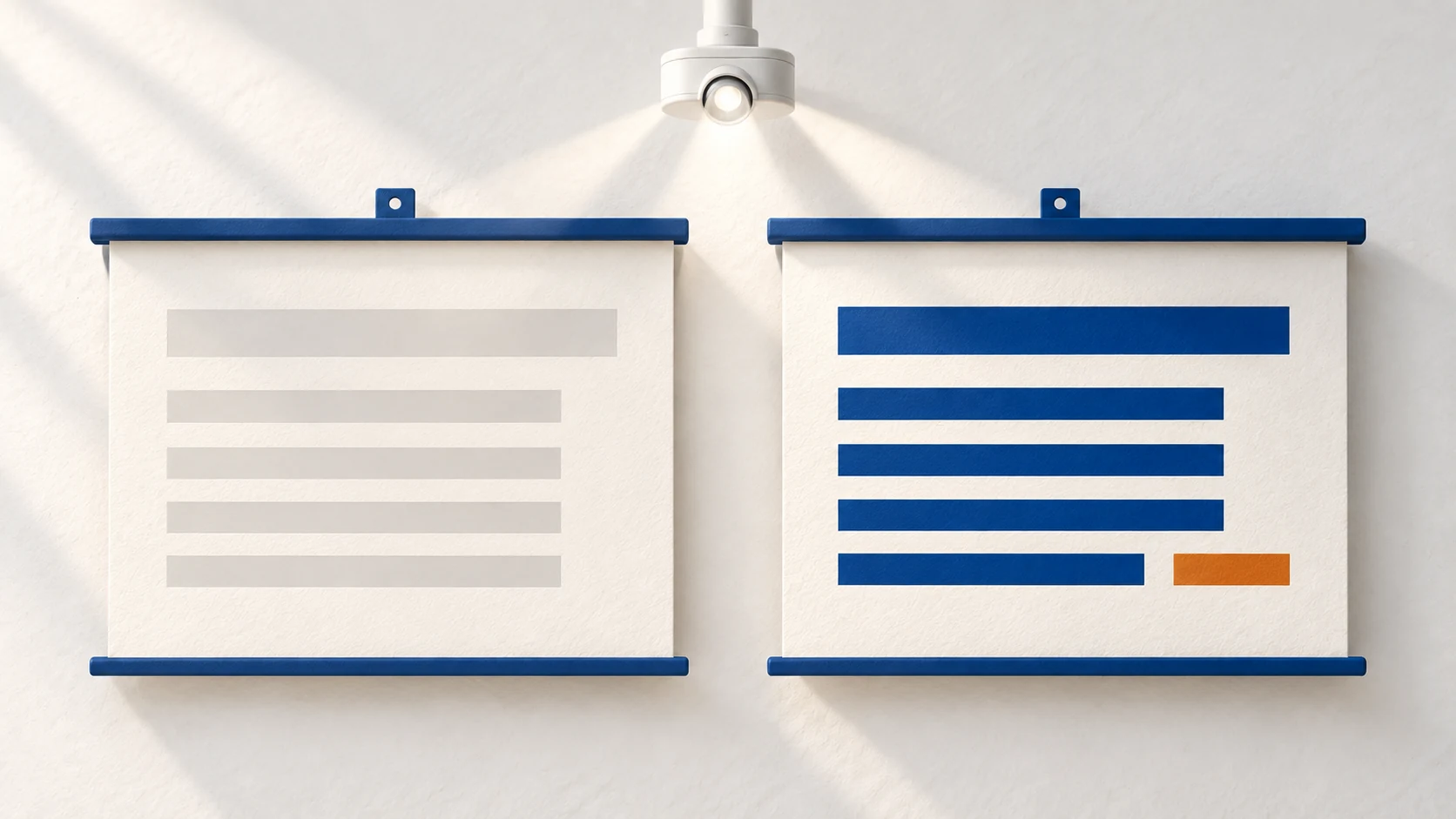
Colors that seem different can still make words hard to read. The difference between text and background has a number called a contrast ratio. A higher ratio means a stronger difference.
The W3C publishes the web's accessibility rules, called WCAG. For text contrast, they have a minimum level, called AA, and a stronger level, called AAA. At the minimum level, normal text needs a contrast ratio of at least 4.5:1 and large text needs at least 3:1, under WCAG 1.4.3. Here, large means at least 18 point, or 14 point bold. At the stronger level, normal text needs 7:1 and large text needs 4.5:1, under WCAG 1.4.6.
Use 4.5:1 as the minimum for your body text. A heading may qualify as large text under WCAG, but I use the higher 4.5:1 target for Accent 1 because it carries headings across slides and gives me a clearer test for that color.
A projector in a bright room makes weak contrast weaker. Check the finished slides in the presentation setting when you can. PowerPoint's Accessibility Checker can flag insufficient color contrast after you apply your colors.
| Text | Minimum (AA) | Stronger (AAA) |
|---|---|---|
| Normal text | 4.5:1 | 7:1 |
| Large text, at least 18 point or 14 point bold | 3:1 | 4.5:1 |
Show the meaning without relying on color
If a chart uses colors to separate categories, put a clear label beside each part. Someone should understand the point without identifying a shade.
Microsoft says color should not be the only way you convey information. Someone who is blind, has low vision, or is colorblind may miss a distinction that exists only in color.
Color vision deficiency affects about one in 12 men and one in 200 women, according to Colour Blind Awareness. The US National Eye Institute also says about one in 12 men have it. Those figures give you a reason to check how your chart reads without its colors.
Microsoft also notes that white and black schemes make text and shapes easier for colorblind people to distinguish. With any palette, a label can explain what a colored shape means.
Pick fonts people can read from the back
Choose one font or a pair: one for headings and one for body text. A heading font can give the deck character, while the body font needs to make longer lines easy to read. You do not need a new font every time the slide changes.
Microsoft's PowerPoint accessibility guidance recommends 18pt or larger text, sufficient white space, and a font style called sans serif. Microsoft names familiar options such as Arial and Calibri.
Size does more for readability than a distinctive typeface. If people at the back cannot read a line, make it larger before searching for another font. Tiny text may need fewer words.
Use heading and body fonts consistently. If one font handles both jobs well, use one.
Build and check a theme in one place
I built the free presentation theme generator for the point where you know your topic but still need to choose actual colors and fonts. Type your presentation topic, who will watch, and the feel you want. There is an optional box for another constraint, such as a dark background, avoiding red, or matching a navy logo.
You choose between one and five themes, one font or a font pair, and one to three accent colors. Each theme shows a background, text color, and accents. You can copy each color's code into PowerPoint. That code is called a hex code.
You also get heading and body fonts from Google Fonts or standard PowerPoint fonts, including the weights to use.
The readability check shows text against the background and Accent 1 against the background. You see the contrast ratio and an AAA, AA, or Fail rating. If Accent 1 falls below 4.5:1, the tool fixes it.
You can judge the colors on a title slide, a bullet slide, and a chart slide before using them in your deck. Give yourself 10 minutes to inspect the previews and choose a theme you can read.
Click a color to change its hue, saturation, or lightness. Make it lighter or darker, or use "Improve contrast." Copy one hex code or all of them. Save a slide image or theme card image, or download a starter PowerPoint file.
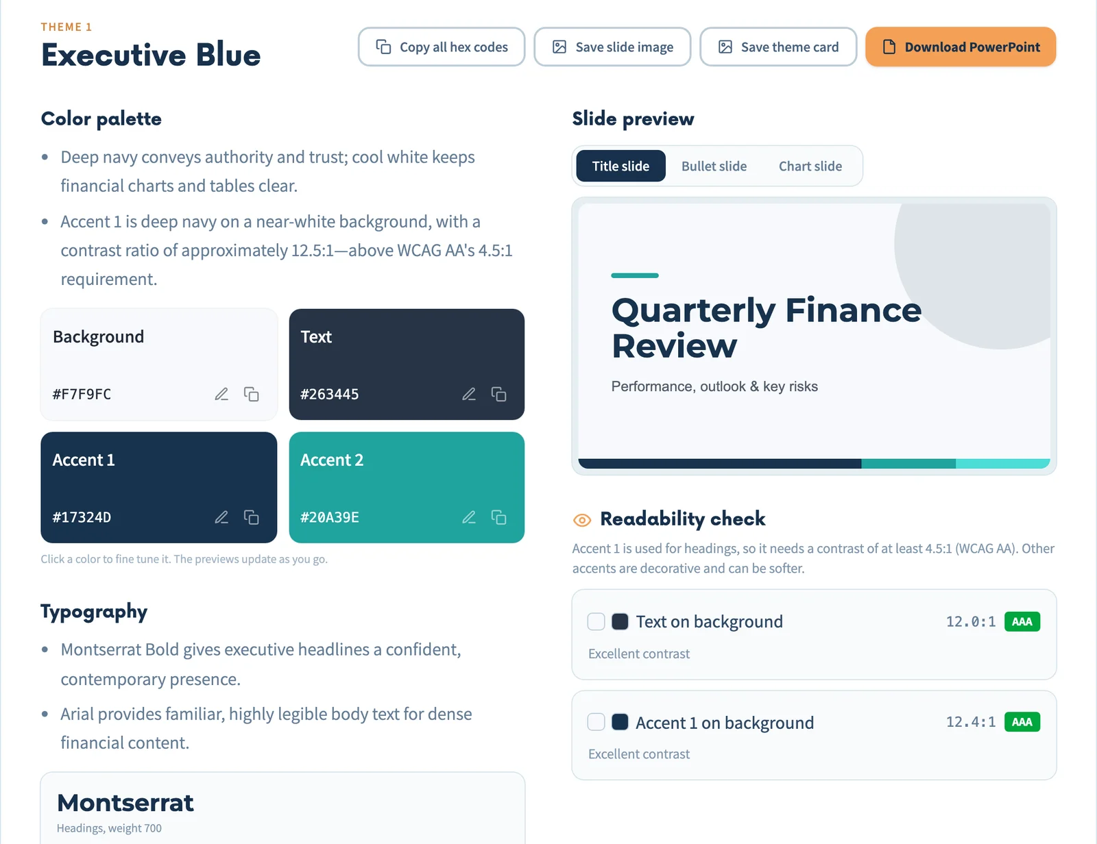
The tool is free for up to 10 generations an hour. For the topic "Quarterly Financial Review," one real output was "Executive Blue." It used a #F7F9FC background, #263445 text, #17324D Accent 1, and #20A39E Accent 2. Montserrat Bold was used for headings and Arial for body text.
Text on background scored 12.0:1, and Accent 1 on background scored 12.4:1. Both checks were rated AAA.
Check the deck before you present
Check the finished slides after your final edits. One changed panel or smaller text box can make a slide harder to read than the theme preview.
Before you present
- 1Name the setting. Check who will watch and whether the deck will appear on a screen or projector.
- 2Count the roles. Keep a background, text color, and one to three accents with a clear job for each.
- 3Check the numbers. Aim for at least 4.5:1 for body text and Accent 1 against the background.
- 4Read from a distance. Make important text large enough and leave space around it.
- 5Read the chart without color. Labels must explain every important distinction.
- 6Run PowerPoint's Accessibility Checker. Recheck any slide where you changed the colors.
FAQ
How many colors should I use in a presentation?
Does every slide have to follow 60-30-10 exactly?
Is 3:1 enough contrast for my slide headings?
Should I use Arial or Calibri for every deck?
Try Your Colors and Fonts Before You Build the Deck
Describe your presentation and get complete themes with hex codes, a font pair, a contrast check and three slide previews.
Free, up to 10 generations an hour.
Open the Theme Generator →Colors, fonts and slide previews · Free